|
|
By: Neil E. Cotter
|
Probability
|
|
|
|
Basic probability |
|
|
|
Venn diagrams |
|
|
|
Overview |
|
|
|
|
Tool: A Venn
diagram shows the sample space, S, as
a unit area (typically a rectangle), and the probabilities of events as areas
whose sizes are the probabilities of the events. The size of overlap between areas indicates
the probability of intersections of events.
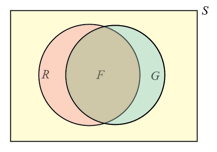
Ex: Let R be the event that a voter is a
republican. Let G be the event that a voter favors government surveillance of
cellphone calls (by compiling logs).
Suppose we have the following data:
P(R) ≡
0.39 (39% republicans [1])
P(G) ≡
0.37 (37% of all voters favor cell phone surveillance [2])
P(F) ≡
P(R)∩P(G) ≡ 0.24 (republican and in favor of
surveillance [3])
Venn diagram:

Note: R and G are the entire circles, while F is only the intersection of the circles.
The Venn diagram makes set relationships apparent visually. The diagram makes it easier to see how to add and subtract probabilities of events and their intersections or unions.
Ref: [1] Wikipedia (accessed 1/18/2016)
https://en.wikipedia.org/w/index.php?title=Political_party_strength_in_U.S._states&oldid=699591358
[2] Gallup poll (accessed 1/18/2016)
http://www.gallup.com/poll/163043/americans-disapprove-government-surveillance-programs.aspx
[3] Pew Research Center (accessed 1/18/2016)